Product Design · 2026
Student Visa Express
A study permit app for students applying to Canada on their own, and the design system I built so it stays consistent, with Claude Code as my build partner.
An immigration app built on a generic template, with no design system, used by stressed students who often read English as a second language.
Built the Foundations v4 design system and a live brand guide, redesigned the applicant journey end to end, and set up a way of working with Claude Code that keeps every change on-system.
One system across the whole product, every answer feeding a red flag or the statement, and the team's first honest read of where applicants stop.
An officer's read, before the officer
Student Visa Express helps international students build their own Canadian study permit application. It asks about their situation, reads their documents, flags what an immigration officer is likely to question, drafts the statement of purpose, and puts everything into one package they submit themselves.
The people using it are under real pressure. A school start date, family money and a future in another country all ride on one file. Many of them read English as a second language. So every screen gets read slowly, under stress, by someone who cannot afford to misunderstand it.
A product that had outgrown its look
When I joined, the app worked but did not hang together. It had been built quickly by several people and an AI website builder, each adding screens their own way. Colours, buttons and wording drifted from page to page, and every new screen made it worse.
- About 99 onboarding questions, and only 22% of applicants finished them
- An audit showed most answers never reached the statement of purpose or a red flag, so people were typing things the product then ignored
- Meaning was carried almost entirely by text, for an audience that often reads English with effort
- No shared rules, so each AI-assisted change could undo the last one
One screen, three versions
The dashboard as I found it, after my first pass, and now. The first pass brought the brand in but kept the old habits. The system is what made it calm.
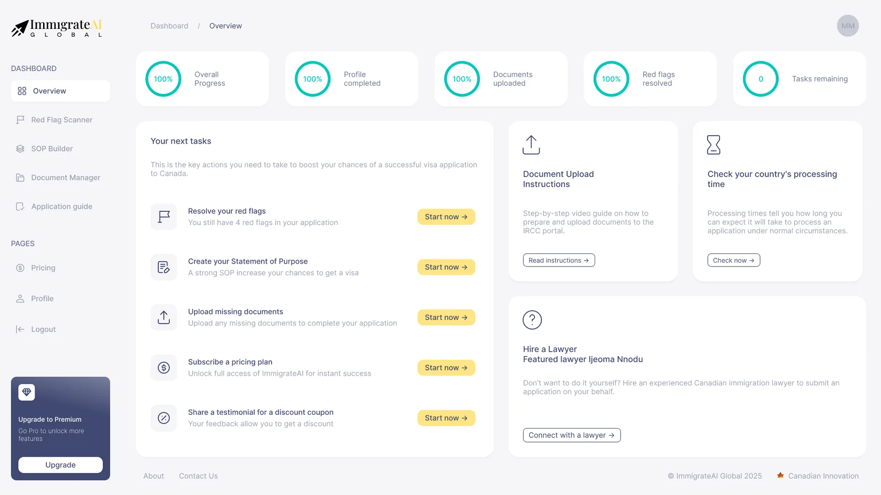
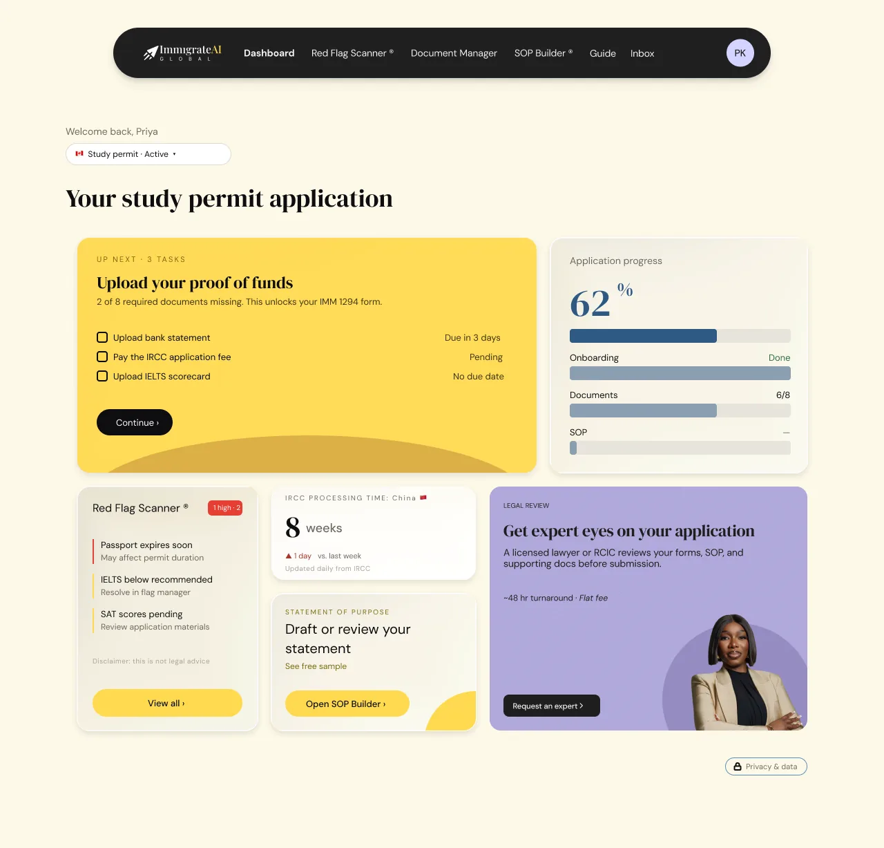
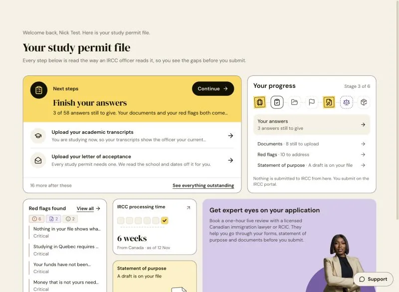
One next step, and a stamp for each stage of the file.
The dashboard, rebuilt from the app's own components with sample data. Hover the cards.
Welcome back, Amara. Here is your study permit file.
Your study permit file
Every step below is read the way an IRCC officer reads it, so you see the gaps before you submit.
- Upload your academic transcriptsYou are studying now, so your transcripts show the officer your current programme.
- Upload your letter of acceptanceEvery study permit needs one. We read the school and dates off it for you.
- Documents · 8 still to upload
- Red flags · 10 to address
- Statement of purpose · Not started
Nothing is submitted to IRCC from here. You submit on the IRCC portal.
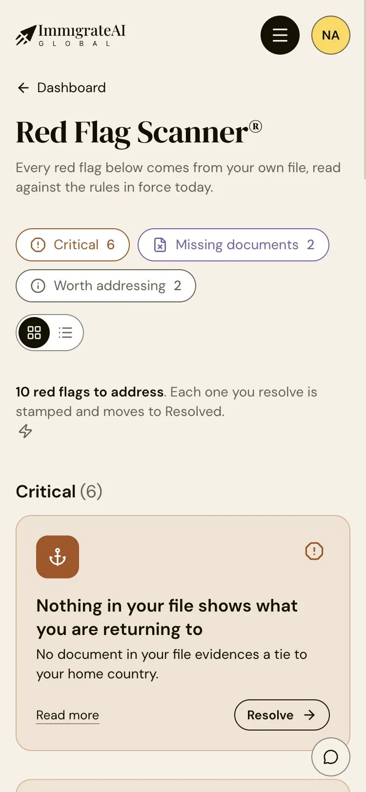
- Nothing in your file shows what you are returning toCritical
- Your funds have not been checked against the current requirementCritical
- Money that is not yours needs a letterCritical
6 weeks
From Canada · sample figure
Not started
Start draftingBook a one-hour live review with a licensed Canadian immigration lawyer or RCIC. They help you go through your forms, statement of purpose and documents before you submit.
Learn more and bookDesigning with Claude Code
I used Claude Code as my main tool: not to generate screens for me, but to build what I designed in the real codebase, check it against live data, and show me the result before anything shipped. The design calls stayed mine. The AI did the legwork, and I reviewed every change before it was committed.
- 01LookQuery the live database and the real screens before proposing anything.
- 02ProposeTwo or three options as working pages, each with a recommendation.
- 03DecideI choose, often with a correction. "Too heavy." "Three and a half steppers."
- 04Build and reviewReal code, tests and checks. I review it before it is committed.
The part that made this work was writing my decisions down. Every rule I settled went into three plain files in the repo: one for the product and its users, one for the design tokens, one for the rules. Every AI session reads them first, so a decision made on a Tuesday still holds the following month, whoever or whatever is writing the code.
- AuditLive data, the questions, ten reference videos
- Foundations v4Tokens, rules, the live brand guide
- Lawyer portalThe reviewer side, on the same system
- UploadsMany files at once, one loading visual
- Funnel analyticsThree pull requests, live the same day
- Demo dayOne student’s session, nine fixes
Foundations v4
The design system came first, because nothing else would hold without it. I took the app back to a small, strict palette that feels like paperwork rather than software: cream and white grounds, ink text, gold for the one main action on a screen, rust for warnings, and purple kept for one job only, the legal register.
Few choices
Two neutrals and nothing between them. One gold button per screen. Five corner sizes. Fewer options meant fewer ways for a page to drift.
Measured
Every pairing is checked for contrast. Card edges were tuned until they measured 3:1 against the cream ground, not against the white card, where they looked fine and were not.
Live, not a PDF
The brand guide is a page inside the app, built from its own stylesheet and components. If the guide looks right, the product does too.
The signature is one stamp. Gold, a perforated edge, tilted a few degrees. It marks something finished, a stage, a document on file, a group of answers, and nothing else, so it reads without English.
From first answer to a finished file
The product follows the order an applicant actually works in, and each stage ends in a stamp. The dashboard and the scanner are shown above.
Most applicants open SVE on their phone first. Every screen is built for 375px before it is built for a desk.
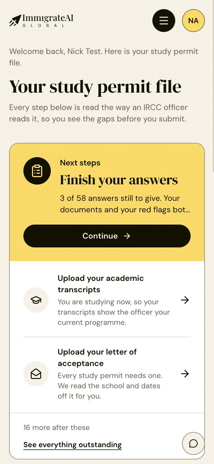
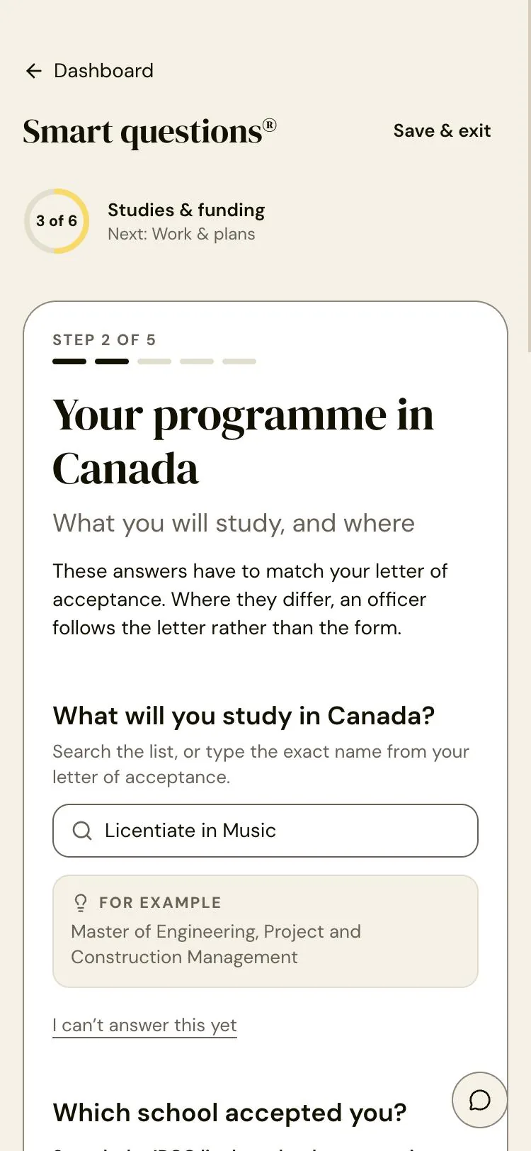
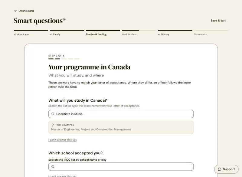
“Answer once”
Six groups of Smart Questions under one stepper. Every answer feeds the documents, the red flags and the statement, so nothing is typed twice.
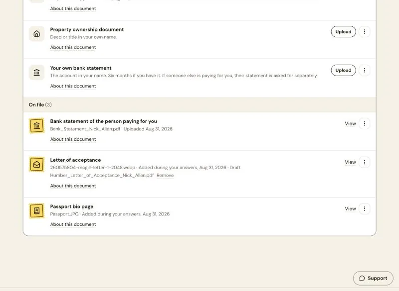
“A stamp when it’s on file”
Every document sits in To upload or On file. A file on record earns its gold stamp; only a missing one is purple.
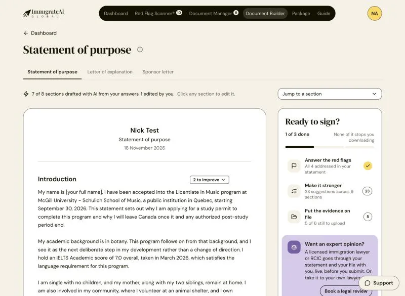
“Your answers, written up”
The statement of purpose is drafted from the applicant’s own answers, section by section. Every AI line is marked and editable.
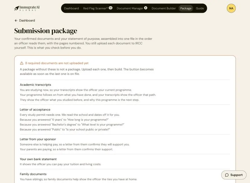
“Why each document is asked for”
The package explains every document in the applicant’s own answers: “Because you answered 4 years…”. They submit on the IRCC portal.
Following the numbers
The team asked where people were dropping off, and nobody could say. So I mapped the journey from live data, proposed the funnel steps for review, then built the analytics into the admin portal with tested database changes and event tracking. It shipped as three pull requests in a day.
The first reading was honest and useful. Fewer than half finish onboarding, and most who stop do so at the same group of questions, "Health and record". That gives the next round of design a precise target instead of a hunch.
What was hard, what landed
Challenges
- Two codebases with unrelated histories and 155 conflicts between them. Work had to be replayed into the company repo by hand until we moved everything to pull requests.
- An AI website builder whose instructions were capped at 10,000 characters. It kept forgetting rules, and once replaced the brand plane with one it generated.
- A dashboard that said "File review: Done" on a file nobody had read. On an immigration application, false reassurance is the one thing the product must never give.
- Answers that went nowhere: 9 of the 14 statement topics the questions produced had no section to land in.
- Payments run live, so checkout could never be tested with a real card.
Wins
- A live brand guide that reads its own rules, so designers, engineers and AI work from one source.
- Every answer wired to a red flag or a statement section, including a new section for admissibility.
- "Done" now means a scan really ran. Not started, done and a count of open findings read as three different states.
- Real IRCC processing times, synced daily, replaced a placeholder figure.
- One student's test session on a demo day became nine focused pull requests the same day.
- Funnel analytics shipped in three pull requests, giving the team its first honest read of where people stop.
What I learned
Working this way, one designer can carry an idea from a sketch to a tested change in production. The speed is real, but it only pays off with judgement and written rules behind it.
A rule that lives only in a conversation is gone by the next session.
// No celebration and no congratulation.// Reward is earned and specific.A stale comment kept steering the code until I removed it.
Built from my notes, the first mock missed most of what mattered.
The funnel pointed at one group of questions, not the whole flow.