UX Design · 2025
Multi-Product
Onboarding
Redesigning the onboarding experience for a multi-product fintech platform — reducing friction, increasing completion rates, and setting a new standard for financial UX in Canada.
The Challenge
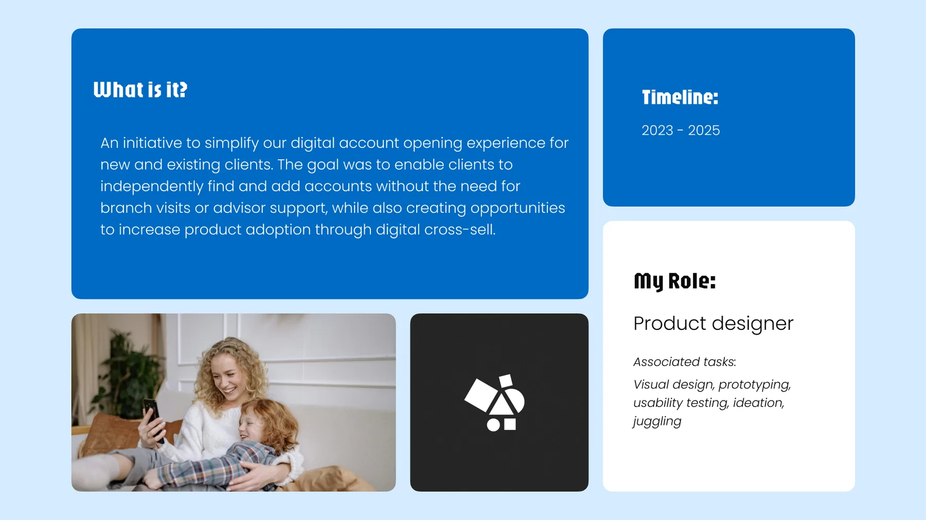
A major Canadian financial institution needed a smarter way to open multiple accounts at once. We redesigned the digital onboarding experience to give clients control, reduce reliance on branch support, and surface the right products without the hard sell.
Friction & repetition
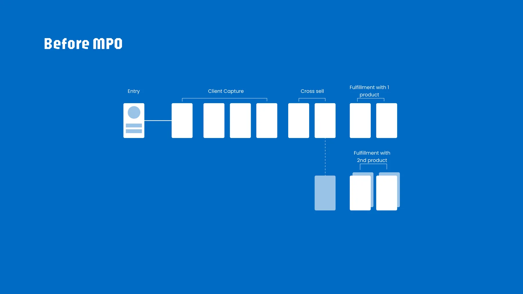
Clients couldn't independently find and add accounts without branch visits or advisor support, creating friction and limiting product adoption. The old flow forced a linear path — entry → client capture → cross-sell → fulfillment — requiring a separate restart if a client wanted a second product.
Building on what we've learned
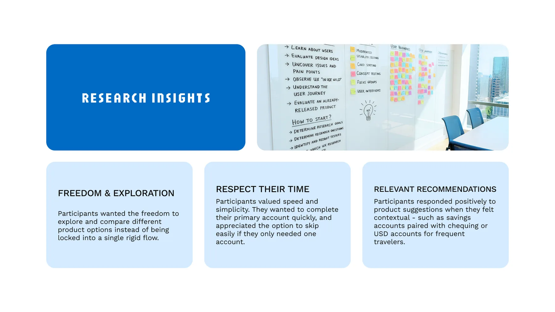
The sprint kicked off with a synthesis phase, reviewing all research, feedback, and concepts from previous rounds of design to identify what was working and what wasn't before any new concepting began.
Mapping the path forward
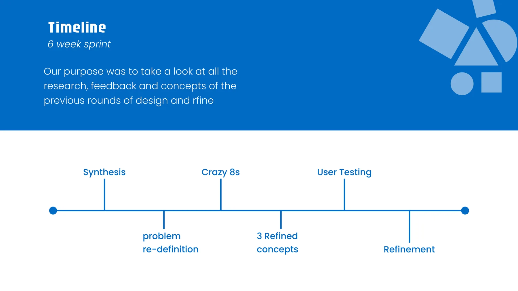
A 6-week sprint structured around synthesis → problem re-definition → Crazy 8s ideation → 3 refined concepts → user testing → refinement. The core design question driving the work: how might we create a digital account opening experience that is effortless and flexible, giving clients confidence to explore products and surfaces relevant add-ons — without being too pushy?
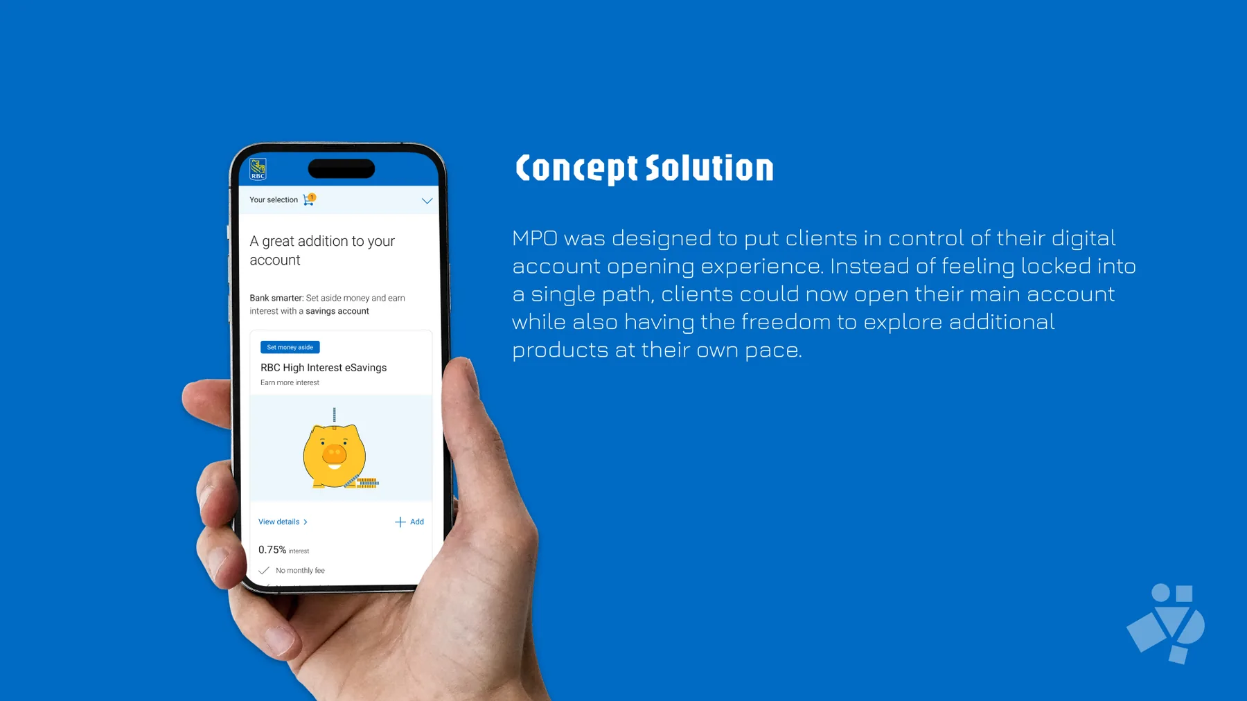
One application, multiple products
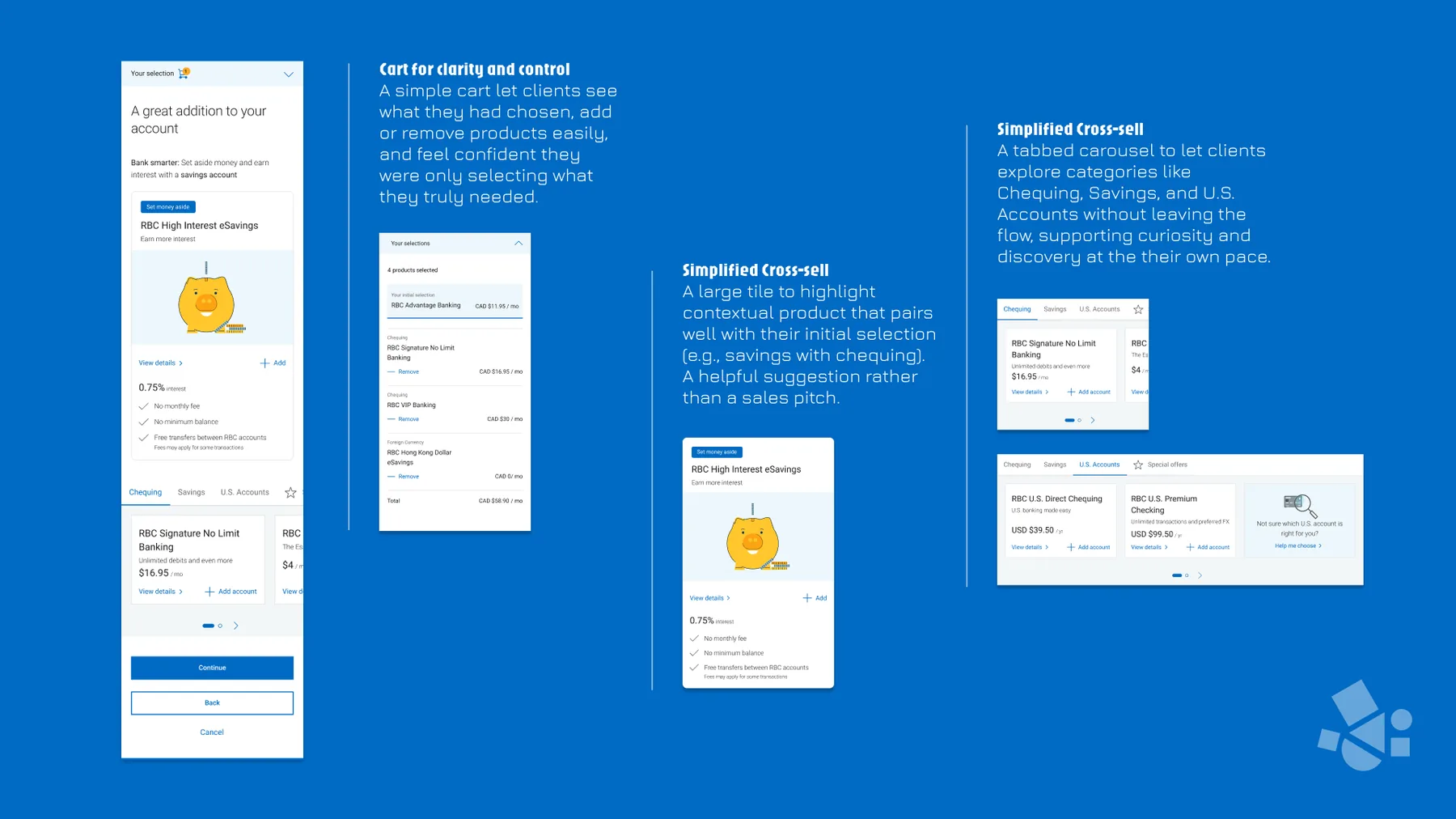
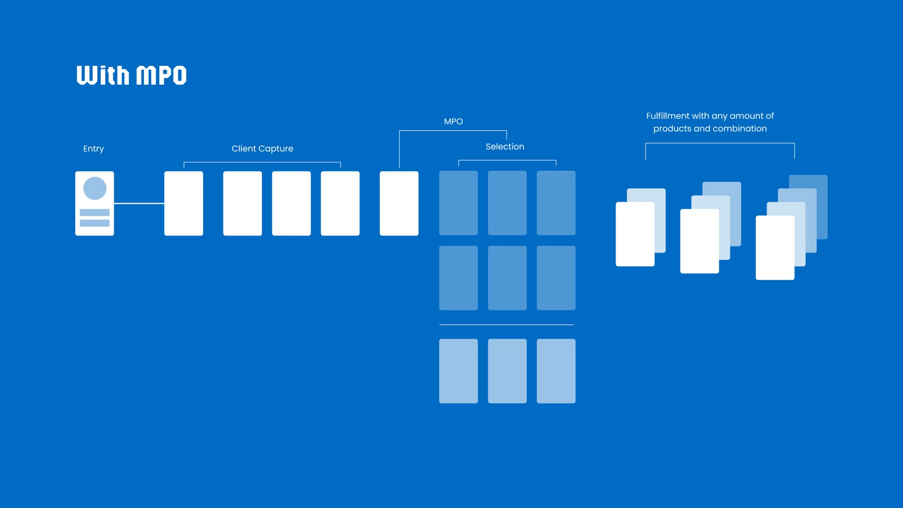
Three key design moves made up the MPO concept:
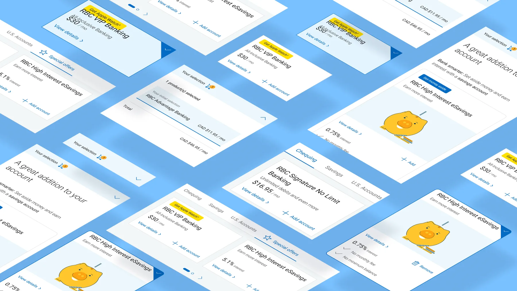
A simple cart UI letting clients see, add, or remove products and feel confident they were only selecting what they truly needed.
A large contextual product suggestion that pairs naturally with the initial selection (e.g. savings with chequing), framed as a helpful recommendation rather than a sales pitch.
Letting clients browse categories like Chequing, Savings, and U.S. Accounts without leaving the flow, supporting curiosity-driven discovery at their own pace.
Impact
The redesigned flow tested well. Task completion improved, time-on-task dropped, and the architecture was adopted as the template for future product launches across the org. More importantly, test clients stopped feeling processed, and started feeling like they had a choice.