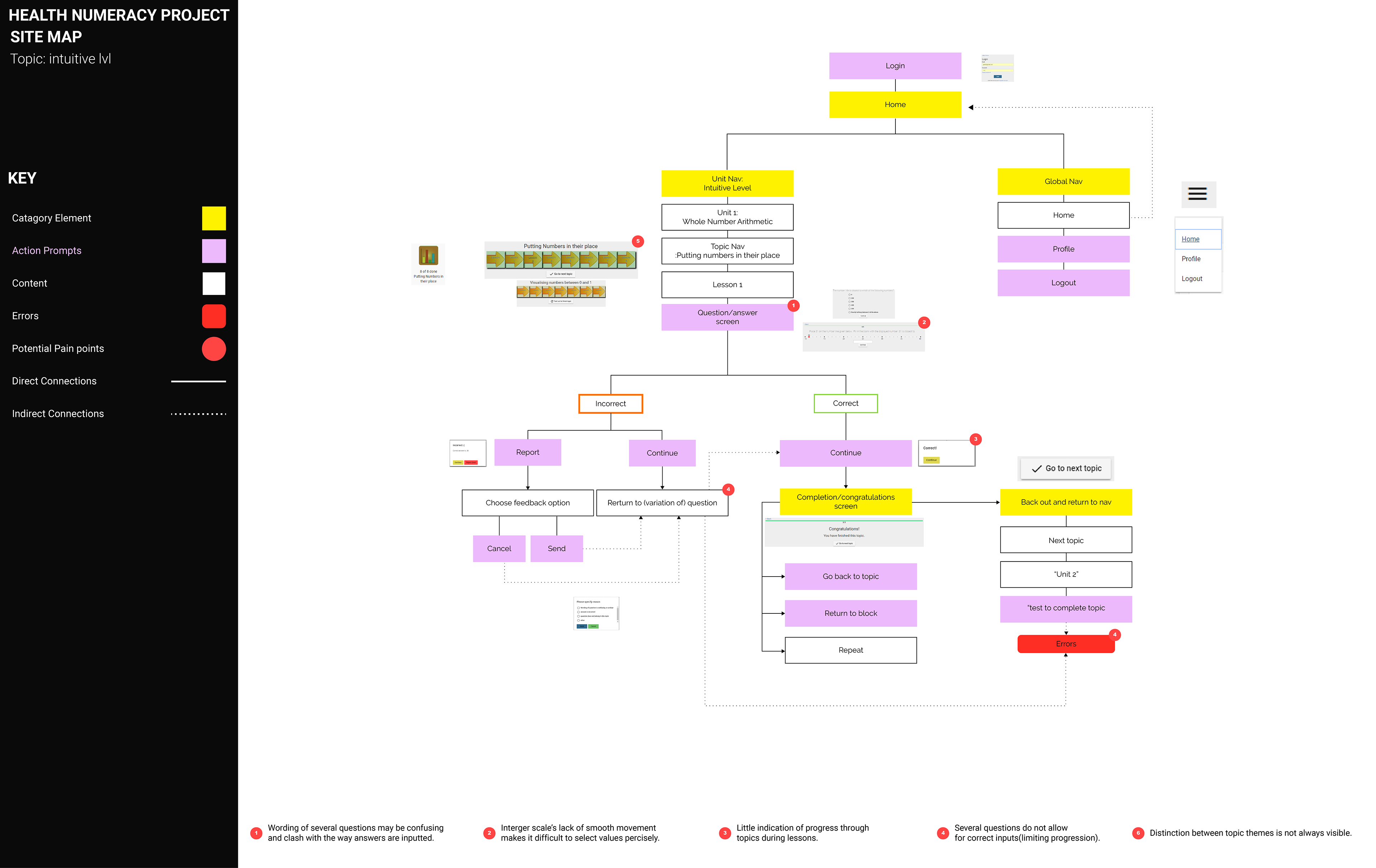
A site map of the original HNP site and its pain points.
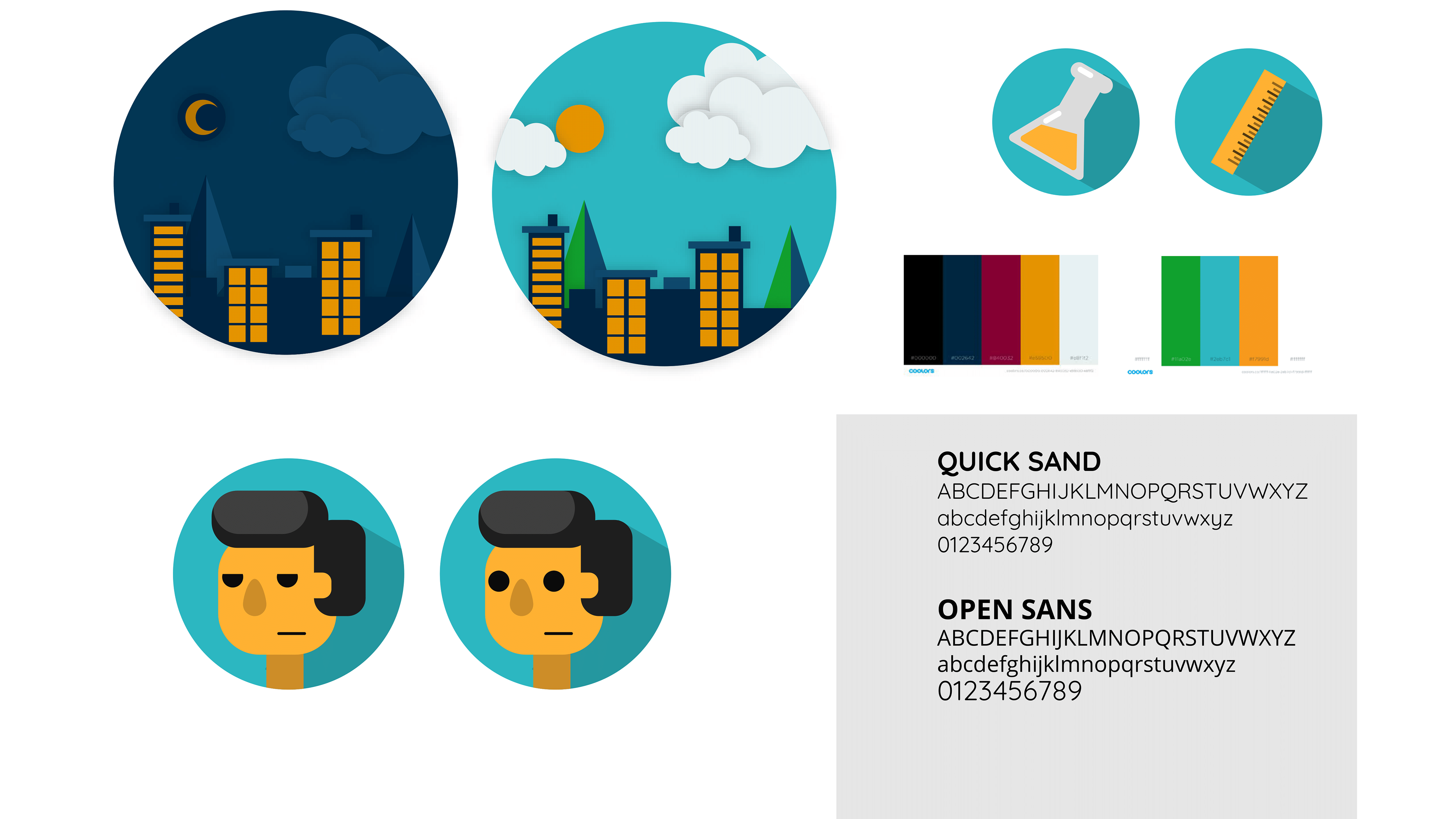
A branding simple created through several rounds of client feedback and workshoping. The direction focuses on approachability and engagement. bright colours and simple shapes were created to draw attention and add personal feel to the abstract and often technical content students were struggling with in the classroom.

This option is simple and helps emphasize the goal of the tool to be more than just teaching math as numbers, but helping build an understanding of the relationships of numerical values to each other, and to the world. The N is built with the blank space between the beads of an abacus.
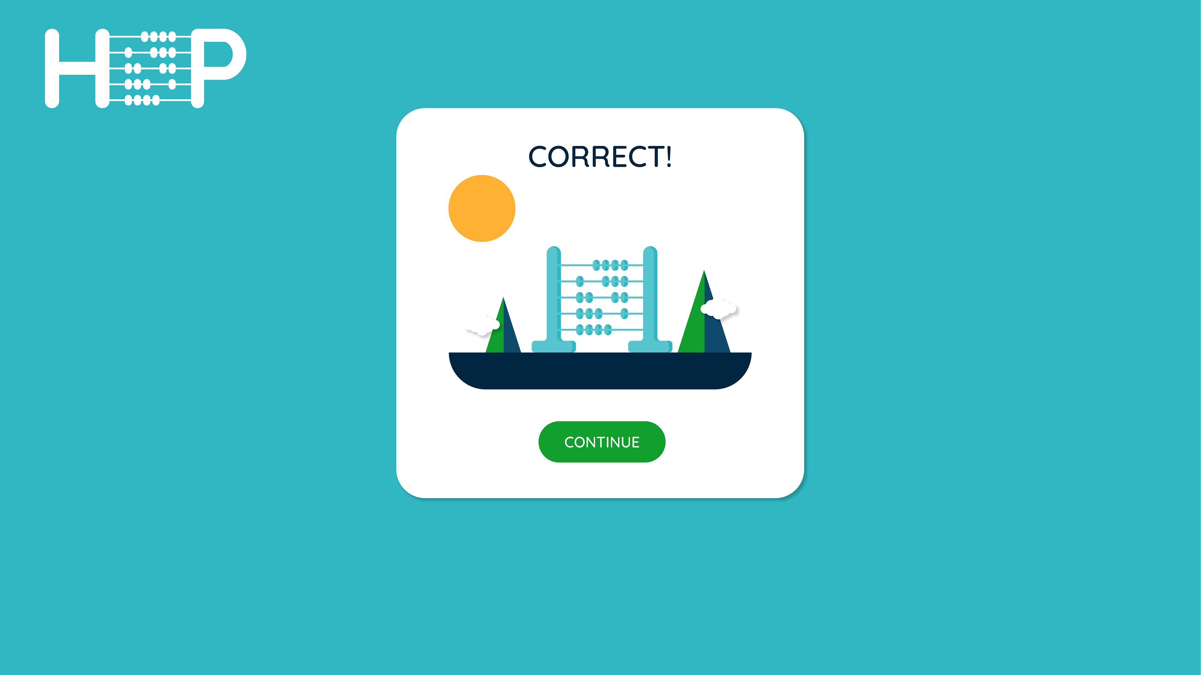
An example of the brand elements being used in a popup window users see after a correct answer.
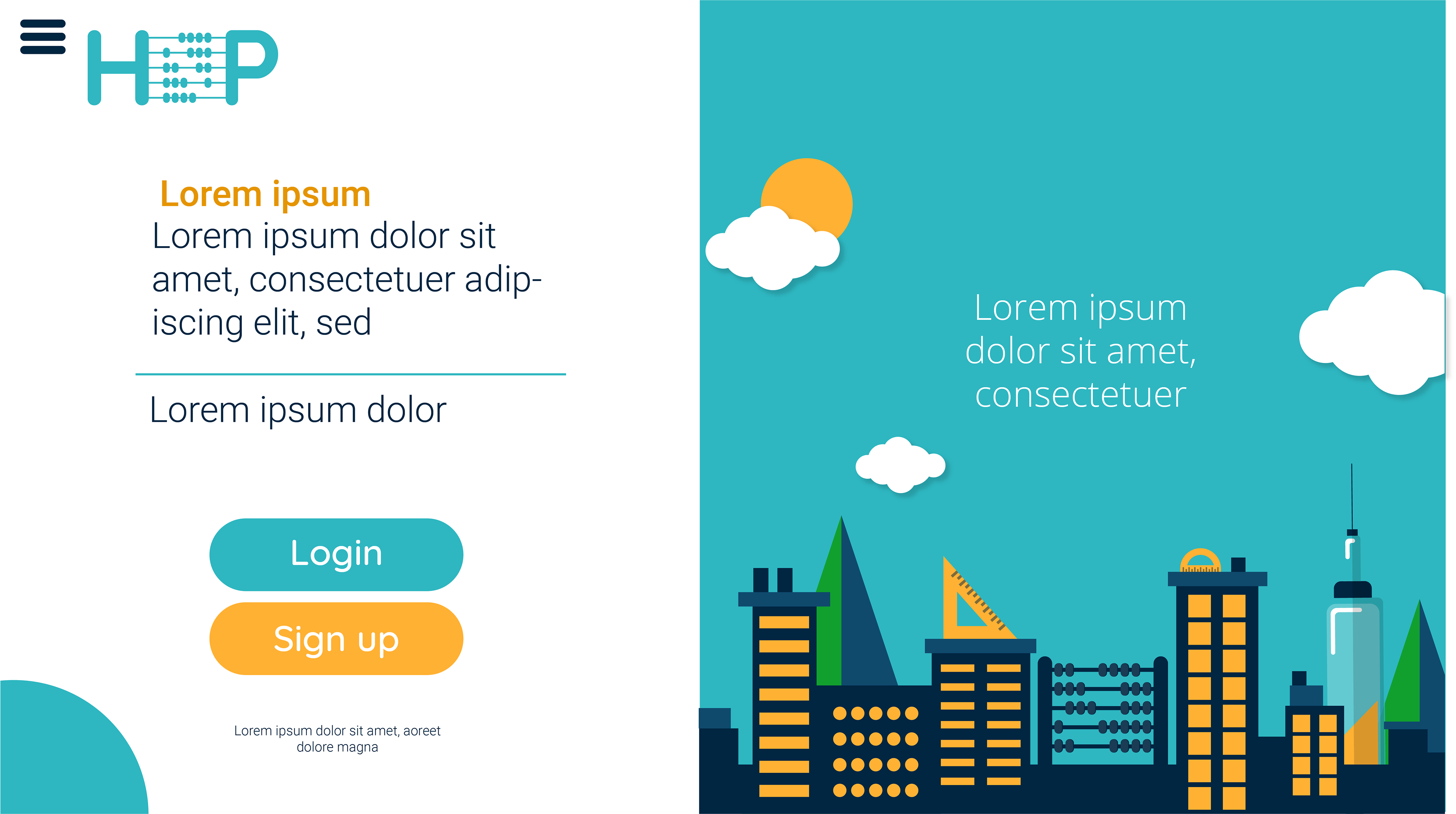
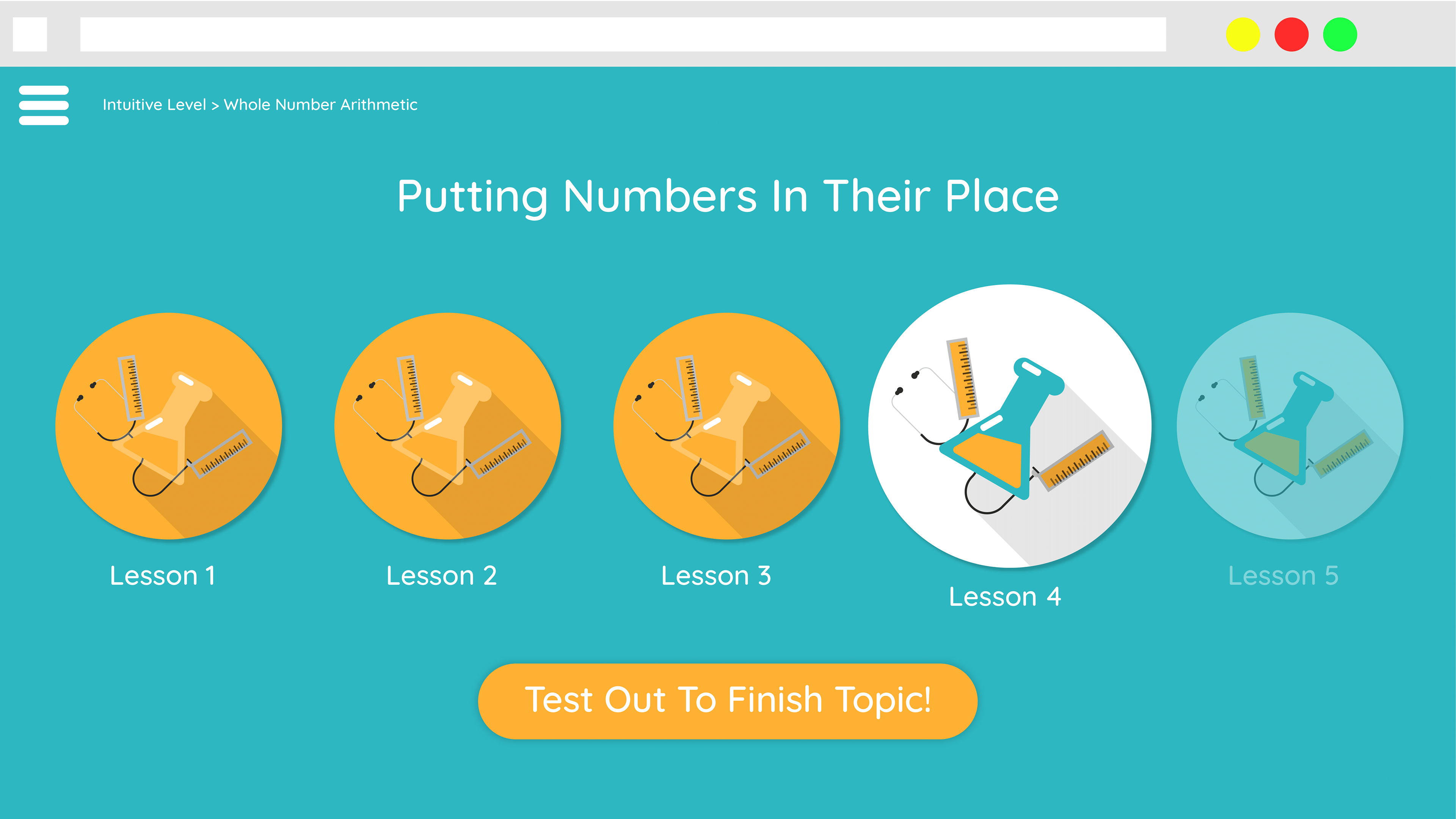
An early mockup of the redesigned landing page.